Thursday 24 September 2015

TEXTURE AND SPACE (week 11)

 its about TEXTURE AND SPACE. I learned so much about what mdm Ling tell us to do. So, i tell you about what the texture is:

Texture is the element of art that refers to the way things feel, or look as if you could feel if touched (the illusion of touch).

Types of textures

Texture is the character of a surface and is both tactile and visual.
  • Tactile texture is the tactile quality of a surface, such as rough, smooth, sticky, fuzzy, soft or slick. A real texture is one you can actually feel with your hand, such as a piece of sandpaper, a wet glass, or animal fur. It also can be created by an artist by doing a collage.
  • Visual texture is a visual quality of a surface. It is the result from painting or drawing as the real texture.  Visual texture is an illusion of texture created by an artist. Paint can be manipulated to give the impression of texture, while the paper surface remains smooth and flat.   


This four images are examples of Tactile texture:


Two examples of tactile texture: 


textile


writing 


Madam Ling told us to go outside and create an artwork based on materials we collected and paste it on a4 Paper. So this is the result after collecting and glued all things and paste on a4 paper


PRINTING ( week 10 )

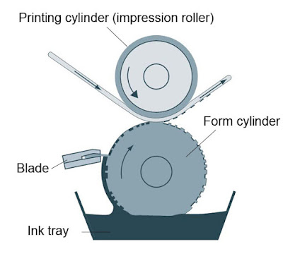
Printing is a process for reproducing text and images using a master form or template. The earliest examples include Cylinder seals and other objects such as the Cyrus Cylinder and the Cylinders of Nabonidus. The earliest known form of woodblock printing came from China dating to before 220 A.D. Later developments in printing include the movable type, first developed by Bi Sheng in China. The printing press, a more efficient printing process for western languages with their more limited alphabets, was developed by Johannes Gutenberg in the fifteenth century.Modern printing is done typically with ink on paper using a printing press. It is also frequently done on metals, plastics, cloth and composite materials. On paper it is often carried out as a large-scale industrial process and is an essential part of publishing and transaction printing.


  • Digital Printing - Desktop printers are important to desktop publishing. It was primarily the introduction of both the Apple LaserWriter, a PostScript desktop printer, and PageMaker for the Mac that kicked off the desktop publishing revolution.


  • Offset Lithography - Lithography is an "offset" printing technique. Ink is not applied directly from the printing plate (or cylinder) to the substrate as it is in gravure, flexography and letterpress. Ink is applied to the printing plate to form the "image" (such as text or artwork to be printed) and then transferred or "offset to a rubber "blanket". The image on the blanket is then transferred to the substrate (typically paper or paperboard) to produce the printed product.


  • Gravure Printing - Rotogravure (roto or gravure for short) is a type of intaglio printing process, which involves engraving the image onto an image carrier. In gravure printing, the image is engraved onto a cylinder because, like offset printing and flexography, it uses a rotary printing press.

  • Laser printing is an electrostatic digital printing process. It produces high-quality text and graphics (and moderate-quality photographs) by repeatedly passing a laser beam back and forth over a negatively charged cylindrical drum to define a differentially-charged image.


CREATIVE INDESIGN ( week 9 )

InDesign-Poster


Do you want to make a basic poster design but don't know where to start? Use this tutorial and you'll be making simple posters like the one below in no time. This tutorial is for those who are new to InDesign and want to develop their skills, or for anyone who just wants to brush up on the basics.
If you want to learn more skills for creating posters and other similar projects, try one of our Adobe Courses which include InDesign and Illustrator or one of our popular Photoshop Training Courses.
Firstly, open the program and click on the "Create New - Document" button
In Design Poster Tutorial Opening-Page
The document setting screen will appear. Choose the page size - for this example we will use A3 - and the margin size. It's good to have around 20 mm of margin for a project like this. Put the same value as the margins in the "Gutter" box.
Make sure you un-check the "Facing Pages" box, keep the default "portrait" setting and then press OK.
In-Design-Poster-Tutorial-2
To create a title or standout piece of text at the top of the page, firstly click on the "T" button on the left-hand toolbar. This will give you the option of creating text box. Then click on the ruler bar at the top of the page and drag a "guideline" down to the point where you want the text box to end. If you notice in the top corner, there is a box that measures the size of this guideline. Make it 100mm. To learn how to make a poster template so you don't have to do this formatting each time you create one, check out our post "Creating Templates in InDesign CS5".
InDesign-Poster-Tutorial-3
Next, drag the cursor from the top corner of the inner margin to the opposite bottom corner of the guideline. Before you release the button it should show a blue selection line like this:
In-Design-Poster-Tutorial-4
Now, press the "A" symbol just below file in the top left corner and a different "text" tool bar will appear at the top of the screen
In-Design-Poster-Tutorial-5
You can now choose the font style and size for your title. We'll keep the Minion Pro font for now, but change the size to 150 pt. You can also decide to make the text bold or italic. For this, choose Bold.
Then write your text.
In-Design-Poster-Tutorial-6
You'll notice that the text is aligned left. For a poster, you'll probably want the text centred so the easier way to do this is to change the right hand tool bar from Essentials to Typography by picking from the drop down menu  at the top of the screen.
Click on the option that says paragraph and a formatting box appears. Click on the selection arrow at the top of the left tool bar and then on the text box.Then click on the centre button in the formatting box. Then also click on the align centre in the top tool bar to move the text into the middle (vertically) of the box.
In-Design-Poster-Tutorial-7
Now to add some colour. Click on the swatches tab in the right tool bar and you'll notice two small buttons: a square and a "T". We want to fill in the background first so make sure the square button is clicked in. You can choose from a default colour or you can create a custom one by pressing the button in the top corner of the box and selecting new colour swatch.
In-Design-Poster-Tutorial-8
 For this we will be using a quite vibrant orange.
In-Design-Poster-Tutorial-9
Click OK and the text box will be filled with your custom colour. Now to change the colour of the text. Click the "T" button in and go through same steps as for the fill colour, picking a different colour to stand out. We'll use blue.
In-Design-Poster-Tutorial-10
That's the title done. Now you'll probably want some kind of image as the bulk of the poster. For this, select the rectangle frame tool on the left side bar and again drag the cursor from the top ruler down to the bottom point of where you want the picture to be, like this:
In-Design-Poster-Tutorial-11
Next, drag the cursor from the top corner of where you want the picture to the guideline you've just made, which should look something like this:
In-Design-Poster-Tutorial-12
Go to File, Place and find the image you want and press OK. It will appear like this in the box you've made.
In-Design-Poster-Tutorial-13
To get the picture to fit the box, right click and press "fitting", "fit frame proportionally". You can then adjust the image to the size and fit you'd like by dragging on the outer lines of the box
In-Design-Poster-Tutorial-14
Nearly there, but we still have some white space at the bottom of the page that we want to fill with more text. So do the same as the title: click on the "T" in the left sidebar and make your text box fit the remaining white space. Choose on the selection arrowclick on the text box and then swatches and fill with custom colour you've made.
In-Design-Poster-Tutorial-15
You may well want to change font here, or you can keep it the same. We'll change it to Mistral and set the font size as 120 pt. Centre horizontally and vertically.
In-Design-Poster-Tutorial-16
Finally pick the custom text colour as before. To see the finished product without the guidelines go to view, grids & guides and hide guides.
In-Design-Poster-Tutorial-17
And there you have it, as basic poster format in InDesign. As your skills develop you'll be able to introduce more complex elements to the project, but an outline like this is always a great base to start from

MERDEKA POSTER ( week 8 )


THE POSTER OF MALAYSIA

So i will make a short tutorial of how to make a poster like this use illustrator :

1) Open new image like mine

2) Then, google a background that u like to make for your poster

3) Just blend together using InDesign for the first step.

4) And then convert to illustrator and change to vector

GESTALT PRINCIPLE (week 7)

Last week Madam Ling introduce us to Gestalt Principle. What is Gestalt Principle? Gestalt Principle is a psychology term which means "unified whole". It refers to theories of visual perception developed by German psychologists in the 1920s. These theories attempt to describe how people tend to organize visual elements into groups or unified wholes when certain principles are applied.

the principle are :

similarity


continuation


Continuation occurs when the eye is compelled to move through one object and continue to another object


closure


Although the panda above is not complete, enough is present for the eye to complete the shape. When theviewer's perception completes a shapeclosure occurs


The fifteen figures above form a unified whole (the shape of a tree) because of their proximity


In this image, the figure and ground relationships changeas the eye perceives the the form of a shade or the silhouette of a face


Wednesday 23 September 2015

DESKTOP PUBLISHING (week 6)

So today week 6 i learn about Desktop Publishing. Desktop Publishing is the creation of documents using page layout skills on a personal computer. Desktop publishing software can generate layouts and produce typographic quality text and images comparable to traditional typography and printing. This technology allows individuals, businesses, and other organizations to self-publish a wide range of printed matter. Desktop publishing is also the main reference for digital typography. When used skillfully, desktop publishing allows the user to produce a wide variety of materials, from menus to magazines and books, without the expense of commercial printing.


Desktop publishing combines a personal computer and WYSIWYG page layout software to create publication documents on a computer for either large scale publishing or small scale local multifunction peripheral output and distribution. Desktop publishing methods provide more control over design, layout, and typography than word processing. However, word processing software has evolved to include some, though by no means all, capabilities previously available only with professional printing or desktop publishing.

INDESIGN INTRODUCTION (week 5)

Today i want to introduce you a new software that we will use after this. Its INDESIGN !

The InDesign launcher will pop out like this


InDesign main screen!


You can choose variety of types, but for mine maybe A4


                       New document has created, you can make everything with indesign